The Hidden Symbol in the Lay’s Logo You’ve Probably Never Noticed
Most of us rip open a bag of Lay’s without a second thought — but the next time you reach for your favorite chips, take a moment to look closely at the logo. Behind that familiar burst of yellow and bold red lettering lies a subtle design detail that connects the snack we know today to its nearly century-old origins.
It’s a tiny element most people overlook, but once you see it, you’ll never unsee it.
A Logo Millions Recognize — But Few Ever Study
The Lay’s logo feels warm and cheerful: a rising-sun yellow circle, a curved red ribbon, and the brand’s name across the center.
But design experts note that the logo isn’t just a random combination of colors — it carries a quiet visual tribute to the brand’s parent company, Frito-Lay, which formed when Herman Lay’s potato chip company merged with the Frito Company in 1961.
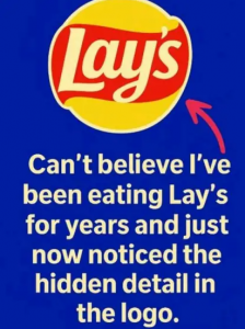
The curved red banner wrapping across the yellow sphere is intentionally reminiscent of early Frito-Lay branding — a subtle homage to the original emblem.
It’s a nod to the company’s roots and one of the most recognizable families in the snacking world.
Most people never notice the connection. But once you realize the shape and layout echo the classic Frito-Lay “banner over sun” style, the inspiration becomes unmistakable.
A Legacy Built Since 1932
Lay’s journey began in 1932, when Herman Lay sold chips from the trunk of his car.
The brand slowly evolved into the global snack powerhouse we know today. The modern logo, though refreshed over the years, still preserves hints of that history.
It’s not just a design choice — it’s a reminder of almost 100 years of innovation, growth, and snack-making tradition.
Every bag of Lay’s carries this visual time capsule, even if most consumers never realize it.
A Bag of Chips… and a Slice of History
So the next time you grab a bag of Lay’s, remember:
You’re not just holding a snack.
You’re holding a small tribute to the company’s beginnings — a design that quietly honors the brand’s journey from a one-man operation to one of the world’s biggest snack empires.
A simple logo with a hidden story.