Most People Never Notice This Hidden Detail in the Wendy’s Logo – Until They Look Closer
Millions of people recognize the Wendy’s logo instantly — the bright red hair, the freckles, the familiar blue-and-white collar.
But tucked inside that cheerful design is a quiet detail that many fans overlook.
It’s not flashy.
It’s not even obvious at first glance.
But once you see it, you can’t unsee it.
If you look closely at the blue ruffled collar, the folds subtly form the word “MOM.”
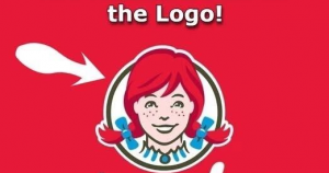
Design experts have long noted that the shape resembles the letters M-O-M, a warm nod to the comforting, homemade meals that founder Dave Thomas wanted Wendy’s to represent.
And while Wendy’s corporate designers have said the resemblance wasn’t intentionally added as a secret message, the connection still resonates deeply with fans, especially considering Dave Thomas’s personal story.
Dave was adopted as a child and often spoke about how the idea of “home” shaped his life.
He built Wendy’s around the feeling of comfort: warm meals, family-style hospitality, and a brand named after his daughter, Melinda (“Wendy”).
Later in life, he became one of America’s most influential advocates for adoption, helping countless children find families.
So whether the “MOM” shape was planned or a happy coincidence, it fits the heart of Wendy’s perfectly.
It transforms the logo from just another restaurant sign into something much more meaningful, a gentle reminder of family, comfort, and the place many of us first learned what a home-cooked meal feels like.
Next time you see that familiar red-haired girl, you won’t just see a logo.
You’ll notice a small detail that captures everything Wendy’s was built to represent.

